Overview
The Momentum app aims to enhance physical and mental wellbeing. Momentum is dedicated to help individuals meet their fitness goals, and support them every step of the way.
The focus of this project is on encouraging Canadian working adults to increase their weekly physical activity to establish a healthier and happier lifestyle.
Project Type: Capstone Project
Role: Lead UX Designer, Researcher, Ideation, Testing & Prototyping
Timeline: 8 weeks
Tools: Figma, Procreate
Platform: iOS & Desktop
The Design Approach
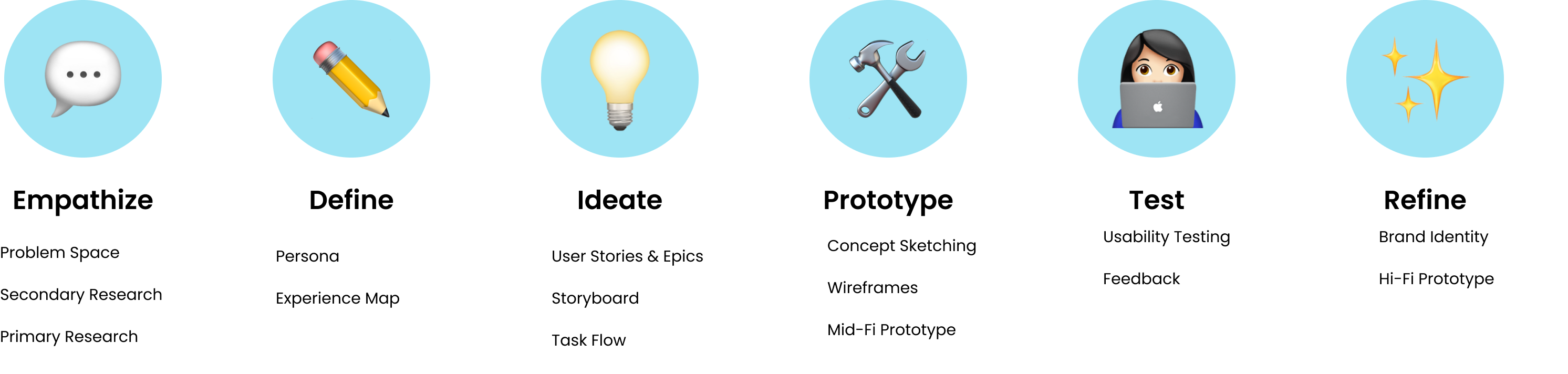
I followed the Design Thinking Methodology and focused on Human-Centered Design to understand users, challenge assumptions, refine problems and create innovative solutions to prototype and test. In focusing on end-users from the very beginning of the creation and implementing user testing for each iteration of the app, I was able to tailor and understand the users' needs.
Empathize
Discovery
The Problem Space
One in two Canadian adults meet the recommended target of 150 minutes of moderate-to-vigorous intensity physical activity a week. Physical activity influences our health and well-being, including improvement in strength, cardiovascular fitness, and mental health. Currently, the government promotes healthy living across Canada by funding projects and initiatives in communities such as ParticipACTION, Carrot rewards, Capsana and more.
Secondary Research
Diving Deeper into the Problem
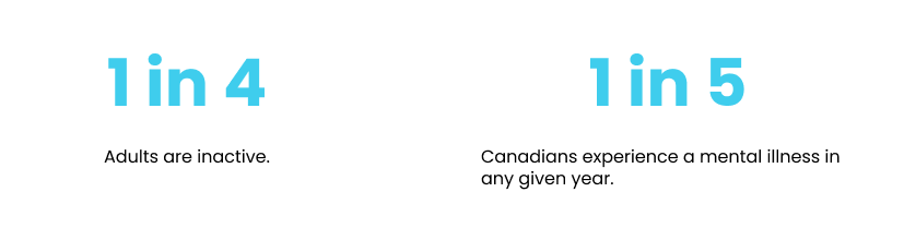
In conducting Quantitative Research, I found that inactivity contributes to 1 in 10 premature deaths. Inadequate levels of physical activity are associated with $117 billion in annual health cost. Barriers to physical activity such as lack of time and lack of social supports need to be addressed.
Physical activity may play an important role in management of mild to moderate mental health diseases, especially depression and anxiety. It is suggested that a minimum of 150-300 minutes of moderate intensity physical activity or 75-150 minutes of vigorous intensity physical activity weekly, and encourages people to exceed these targets.

Primary Research
Themes and Insights
I conducted 11 virtual interviews to explore and understand working adults' relationship with fitness. Participants were between the ages of 18 and 65, living in Canada and were currently working (part-time or full-time). After completing the interviews, I analyzed each interview and categorized responses to identify pain points, motivations and behaviours to create an affinity map. Patterns were identified and were synthesized into three main themes.
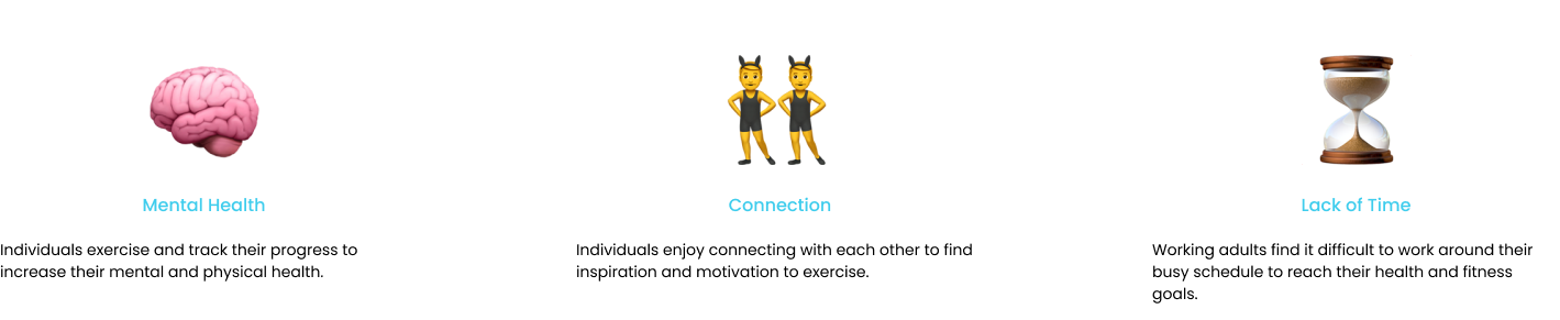
The theme I chose to focus on is: The Lack of time
Working adults find it difficult to work around their busy schedule to reach their health and fitness goals. Participants had the most pain points regarding time. Due to their jobs, and personal life outside of work, many participants find it difficult to schedule a routine. Addressing the lack of time for physical activity will help working adults to overcome the main barrier in achieving their fitness goals. In helping working adults find the time for physical activity, they are able to establish a happier, healthier lifestyle by putting their health first.
Define
Persona & Experience Map
The Moment of Opportunity
In developing a persona and making an experience map, I was able to keep the user in mind throughout the design process and build empathy towards users by having a clear understanding of the users' behaviours and frustrations.
Meet Emily, the busy bee. Emily is a 24 year old Information Technican living in Vancouver who often feels tired and groggy sitting at her full-time job. She wants to find more time and motivation to stay active with her busy schedule.
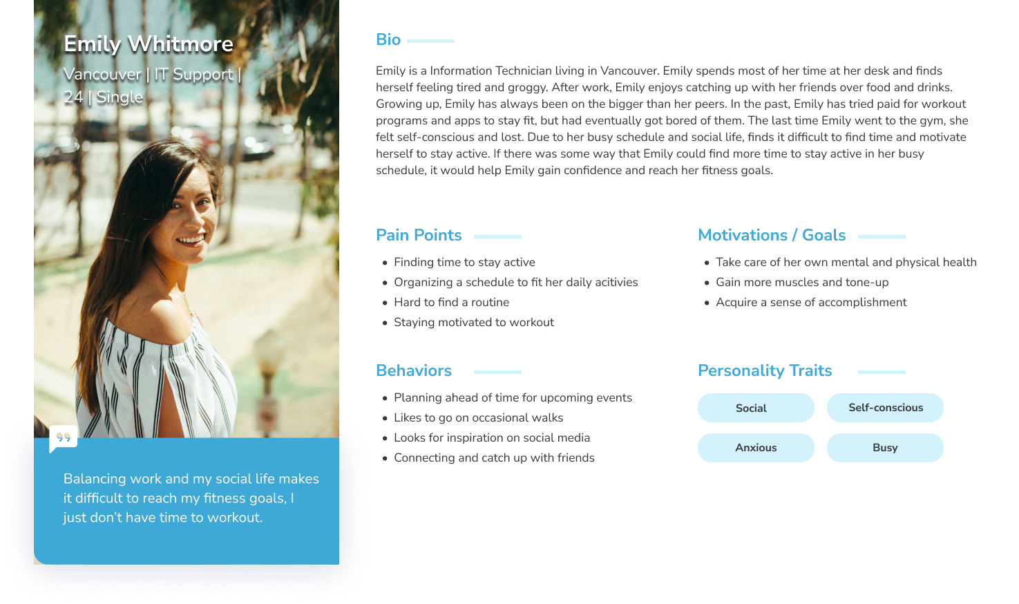
Primary Persona: Emily Whitemore
I created Emily’s journey to visualize an entire end-to-end experience that a person goes through in order to accomplish a goal. This allowed me to identify key moments of opportunity to intervene with a solution.
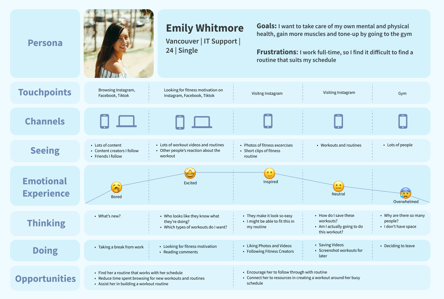
Experience Map: Emily Whitemore
Ideate
User Stories & Task Flows
Design and User Behaviour
To better understand Emily and her goal of finding time to take care of her own mental and physical health, I wrote 30 User stories under different epics. To design and manage a solution for the users, user stories are used to prioritize work and track progress. By following Emily's story, we are able to see our users as real people to clearly define and design features to address their needs.
The Epic I chose to focus on is Planning a Workout:
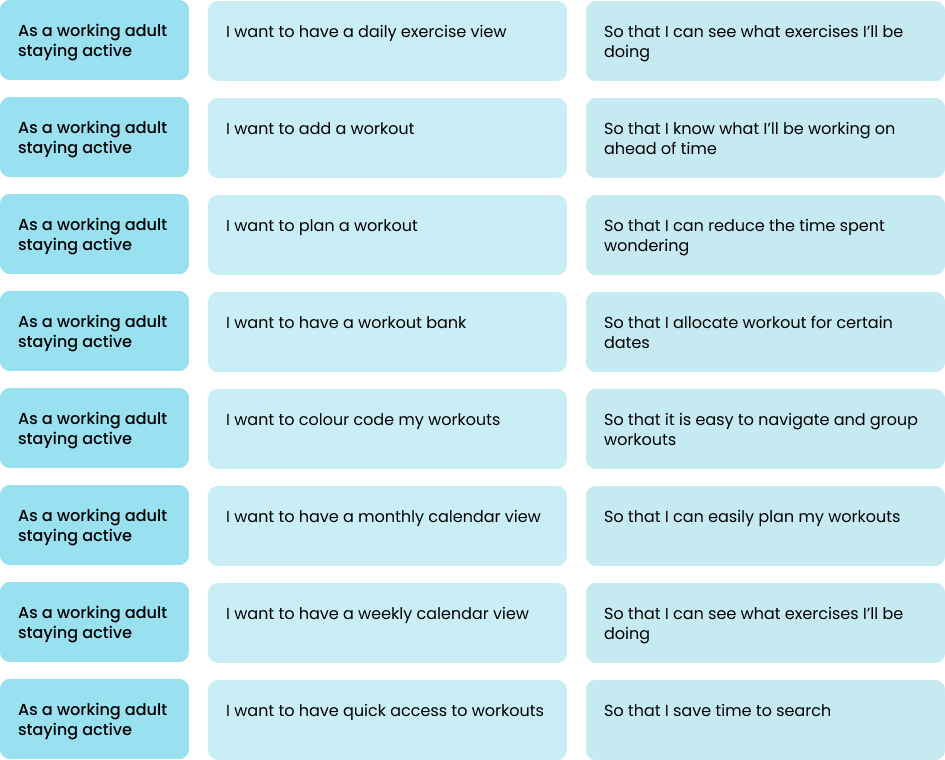
User Stories: Chosen Epic
Task Flow
Designing Interactions
After selecting the epic of Planning a Workout, I created a task flow diagram.
Planning a Workout
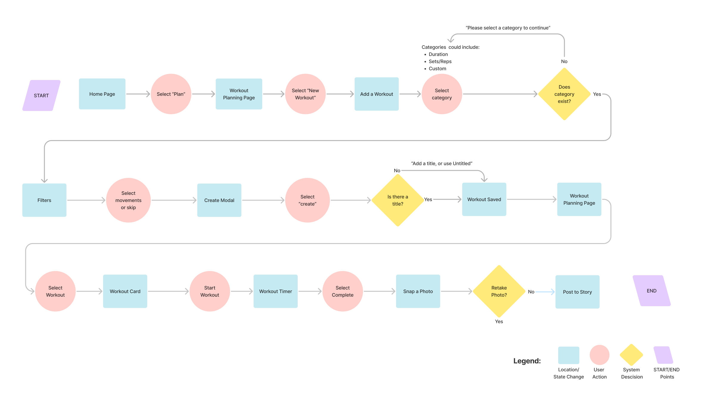
Task flow: Planning a Workout
Prototype
Exploring Solutions
Sketching Concepts
After completing my task flow, I looked for inspiration to build my UI board and began to sketch out different ideas. When sketching, I referred to my UI board to consider components and features.
Exploratory Sketches
Solution Sketches
Mid-Fi Prototype
Grayscale Prototype
With my solution sketches, I began to develop mid-fidelity grayscale prototypes. This will prepare me to conduct user tests to measure the efficieny, accessibility, and usability of the layout, navigation and components.
Mid-Fi Prototype
Test
Usability Tests
Gathering Feedback
I conducted two rounds of usability tests with five users, one persona for each round in order to obtain practical, real-time feedback that can be incorporated to improve the design, in order to provide a more optimal user experience. Each tester was evaluated based on five tasks to help identify areas of improvement. After each round of user testing, I made alterations following Nielsen Norman group's 10 Usability Heuristics for User Interface Design to improve the user's experience.
To further develop the prototype, I addressed concerns based off a Design Prioritization Matrix. Concerns were organized based on the User Value and Effort. This allowed me to assess which concerns should be address first.
Home Page
Usability Issue
- General confusion with content that falls under headings. Recognition rather than recall (Heuristic 9).
What Changed?
- To mitigate confusion and assumptions, I added an example of a Challenge in progress.
- To add further context to the workout page, and activity progress chart has been added to encourage users to meet their daily physical activity goals.
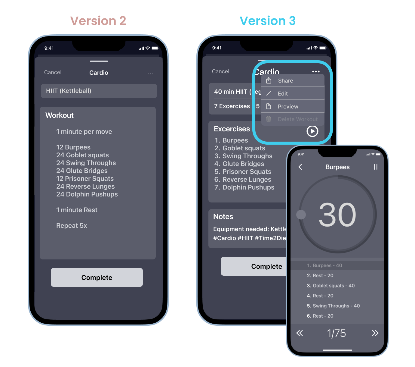
Workout Card
Usability Issue
- The Workout card lacked purpose.
- The meatball menu lacked context, testers made assumptions of what falls under the menu. Match between system and real world (Heuristic 2).
What Changed?
- For the Workout Card to serve purpose, a Play button is added, so users can follow and refer to the workout in real time.
- Context is added to the larger meatball menu with options such as share, edit, preview workout, and delete.
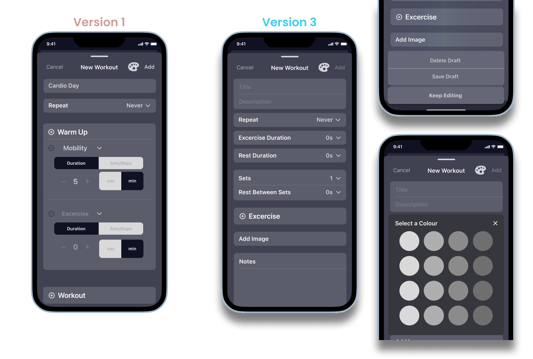
Planning Page
Usability Issue
- Testers had a difficult time navigating the New Workout pop up page due to a lack of flow.
- Testers did not have the flexibility or choice to add on additional information such as number of sets (if required), rest time, notes. Flexibility and efficiency of use (Heuristic 7).
- There was a lack of context for colour palette.
What Changed?
- Everything!
- Navigation issues have been resolved; users accidentally cancels their edits, a popup appears below.
- Users have more flexibility in adding Sets, Rest times, Images and Notes.
- A pop up for changing the colour of the Workout Card was added.
Refine
To Hi-fidelity!
Brand Identity
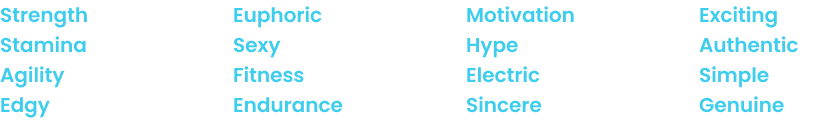
Building the Brand Identity began with establishing keywords that Momentum represents.
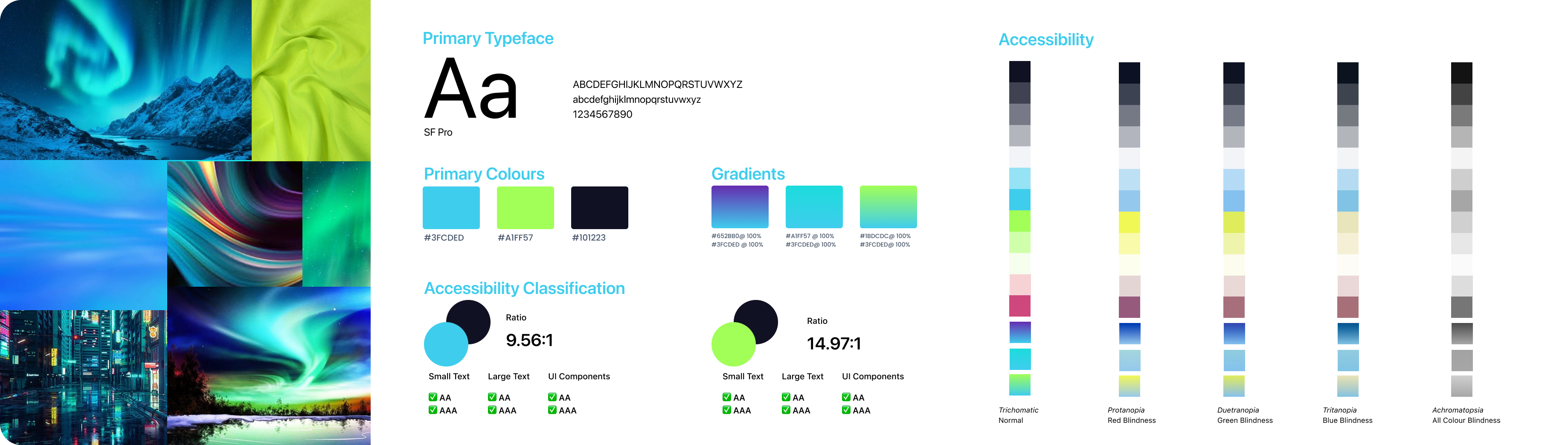
With the keywords, I was able to create a mood board, colour palette and select the typography. Momentum aims to meet the WCAG standards in all standard themes in the system which includes colour contrast and ratios.
Brand Identity
Wordmark & Logo
Building a Brand
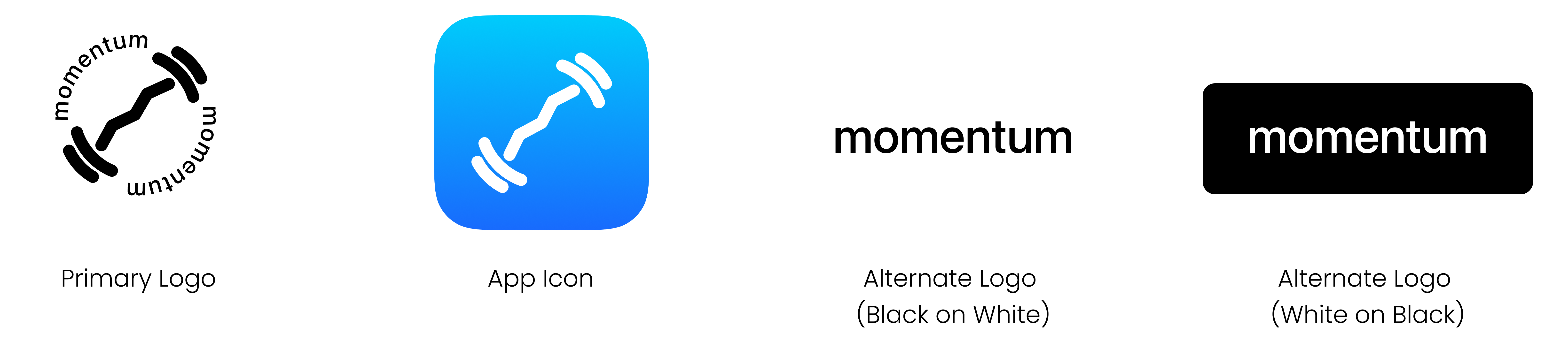
With the brand identity in mind, I curated a list of names then narrowed it down to: Day One, Momentum and Euphoric. Momentum was ultimately the chosen name. In physics, momentum means the quantity of motion of a moving body. The application aims to get everyone moving with momentum. Momentum encompasses movement, it is intentional, and aims for consistency. Building momentum means to develop and continue more quickly and becomes less likely to stop.
Through ideation, I made multiple iterations of the wordmark, logo and app icon.
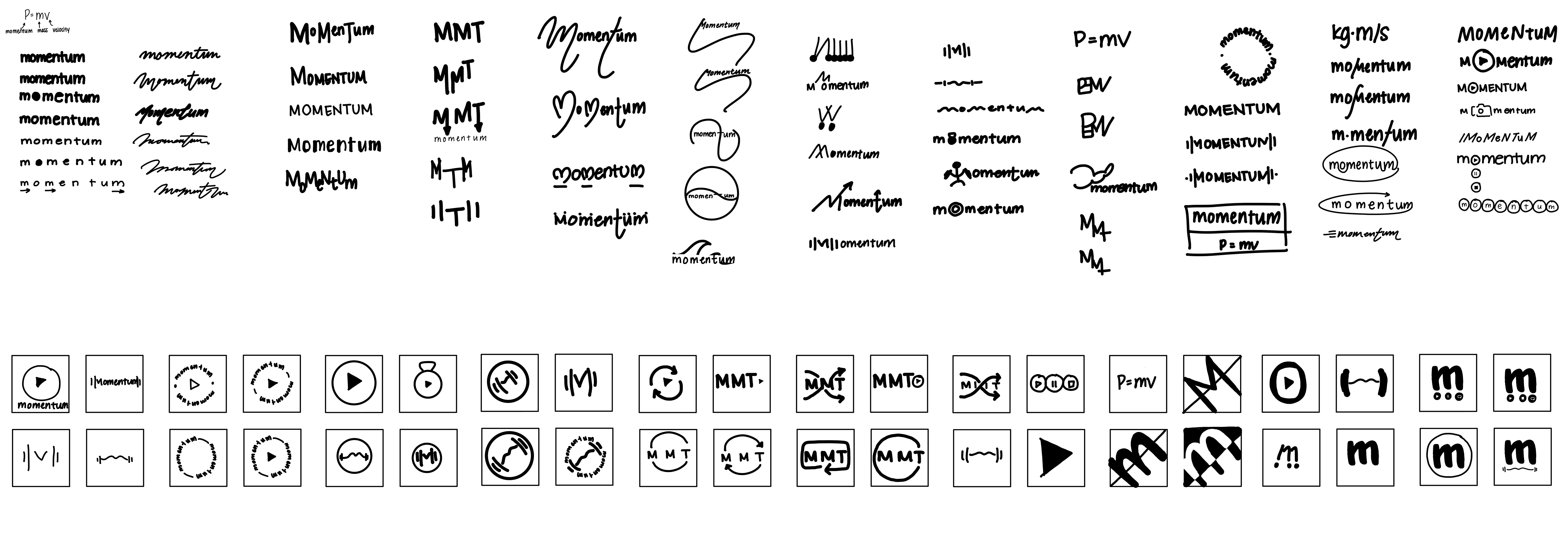
Wordmark and Icon Exploration
Finalized Wordmark and Icon
Ideas to Life
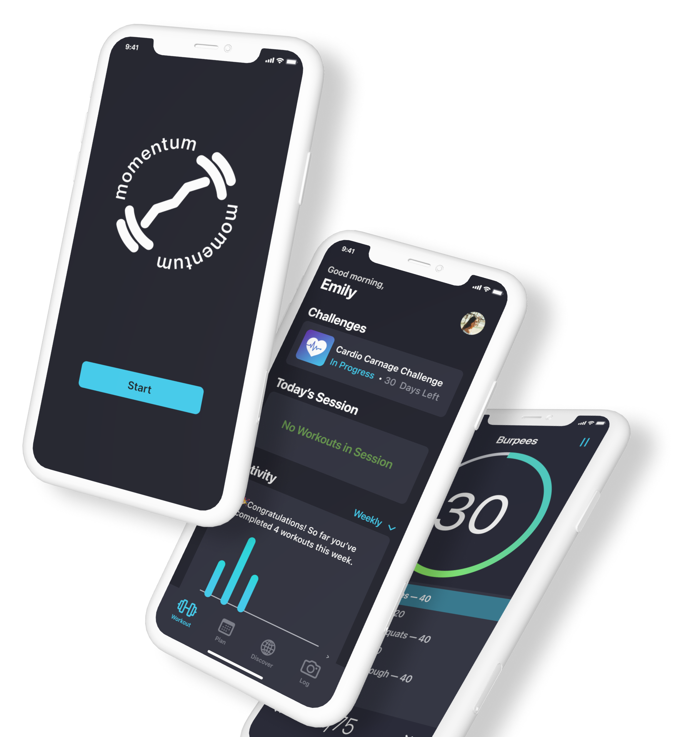
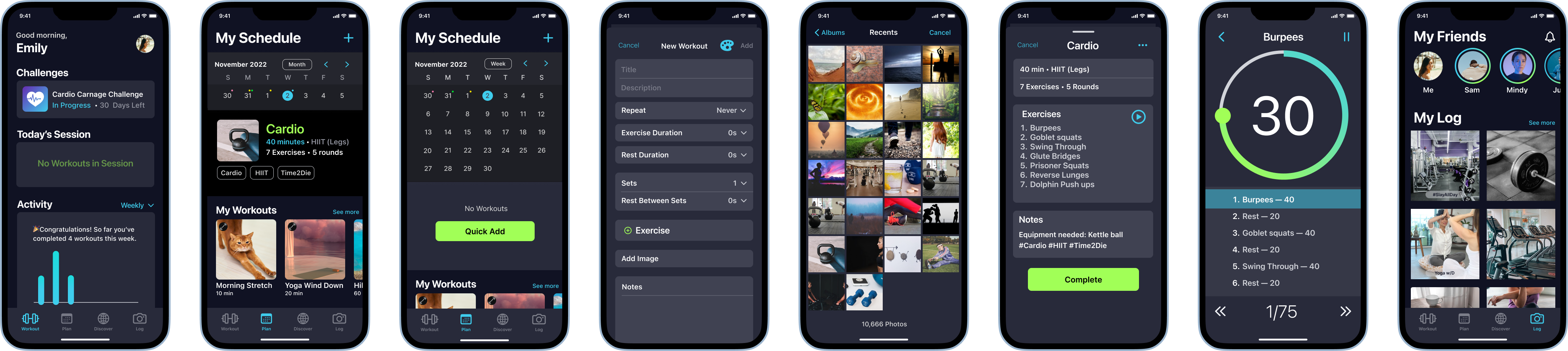
Hi-Fidelity Prototype
In designing Momentum, it is fundamental to demonstrate and display the specification and documentation of the design. The methodology used to structure the UI Library of Momentum was atomic design.
Helping you find the time for physical activity, to establish a happier, healthier lifestyle by putting you health first.
This app aims to help working adults to overcome barriers in achieving their fitness goals.
Going Further
Attracting Interest
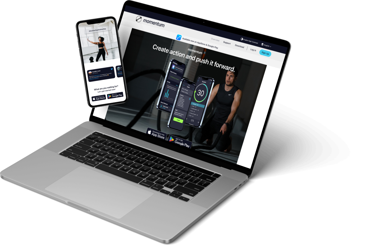
Building a Marketing Website
To attract interest and market the Momentum app, a marketing website for desktop and mobile was created. The digital marketing revolution has made it easy to reach customers around the globe. Having an online presence opens digital channels to allow richer conversations with consumers and commercialization of their products and services.
My Takeaways
Key Learnings
User interviews is key in a successful solution. Making the most out of qualitative research helped me understand and deep dive into the problem space to help me understand why people make certain decisions. In meeting my users, I am able to understand to begin the designing process with them in mind. Using the Human Centered Design Approach means to put the people at the heart of the development process. Making the interview a candid conversation helped identify underlying pain points and behaviours.
Done is better than perfect. When being immersed in the design process, I often time find myself lose track of time. It is important to take a step back to re-evaluate the process to align with the goal and scope of the project.
Next Steps
- Design additional screens and flow to launch the application.
- Continue user testing to identify usability issues to create a better user experience.
- Prepare a design proposal and partner with stakeholders.
Next Project: Electronic Arts App >
