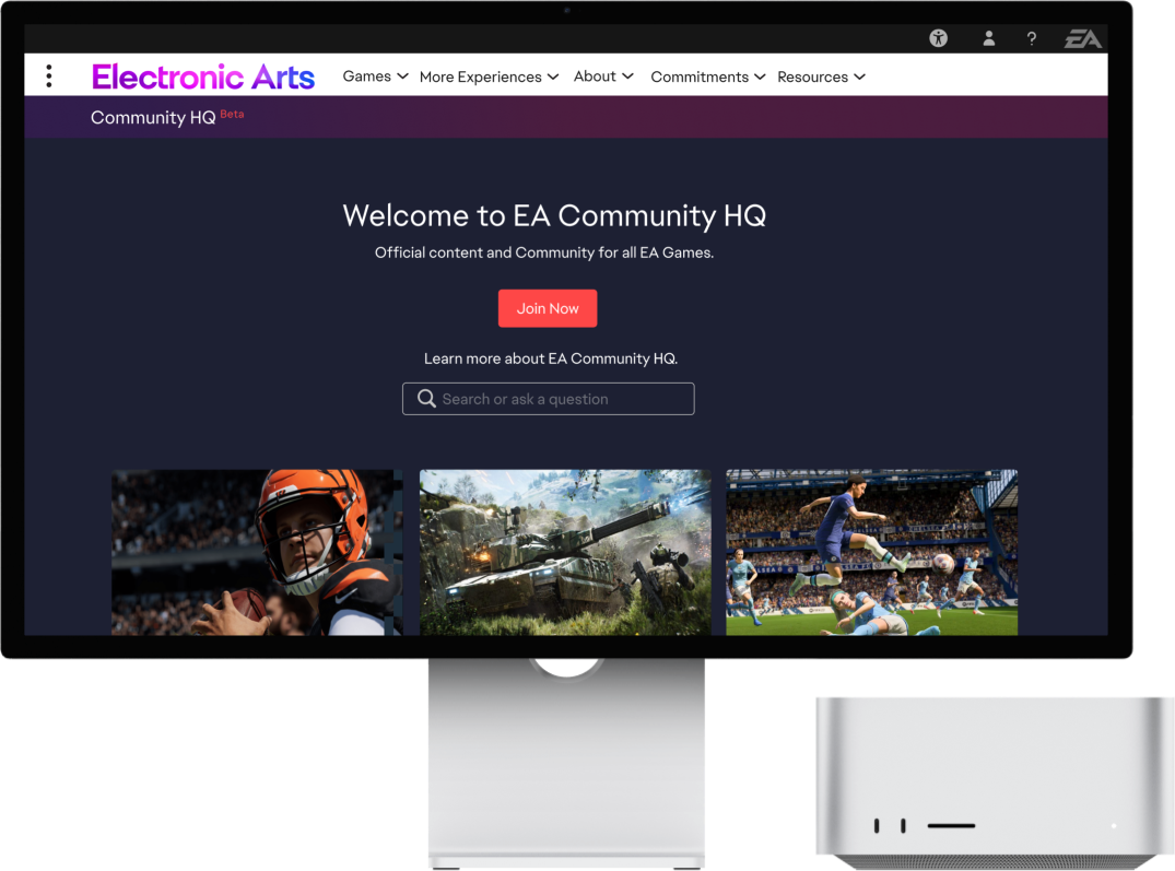
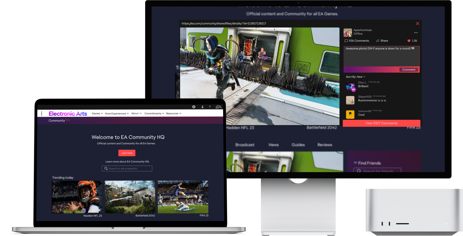
Electronic Arts
Overview
Gaming is one of the largest industries in the world and has a major influence on the future of tech and entertainment. As consumer preferences change, games and platforms shift to align with what customers want.
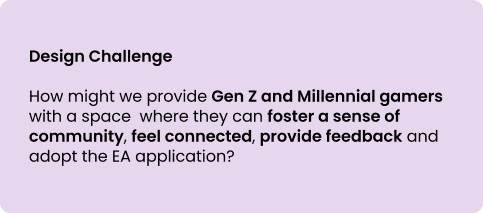
The focus of this project aims to provide Gen Z and Millennial gamers with a space where they can foster a sense of community, feel connected, provide feedback and adopt the EA application.
Project Type: 24 hours Hackathon
Role: Lead UX Designer, Wireframes, Ideation & Prototyping
Timeline: 24 hours
Tools: Figma
Platform: Desktop Website
Our Team
tEAm: Game On

The Design Approach
With a 24 hour time limitation, our team followed a modified version of the Design Thinking Methodology and focused on Human-Centered Design. To meet the requirements, our team's mantra was "divide and conquer!"

Empathize
Discovery
The Problem Space
EA recently replaced its legacy gaming platform, Origin, with a new platform: The EA App. The EA App promises to be faster, more automated and a better overall experience for gamers. It also connects with other services to provide a seamless experience across multiple popular platforms, so how might we ensure that the EA App is adopted by their current users?
Secondary Research
Diving Deeper into the Problem
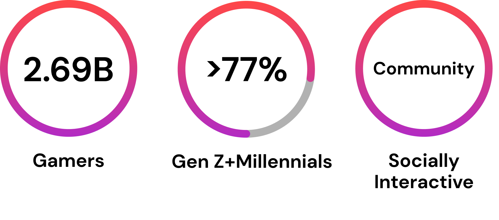
As we know, gaming is an enormous industry, with 2.69 billion gamers worldwide in 2020 and a revenue of over $159.3 billion US dollars. Additionally, Gen Z and Millennials make up the highest proportion of gamers, with 81% of Gen Z identifying as gamers and 77% of Millennials. Most importantly, video games are socially interactive - players are gaming online, with friends and strangers, crossing vast cultural and geographical distances.
Primary Research
Themes and Insights
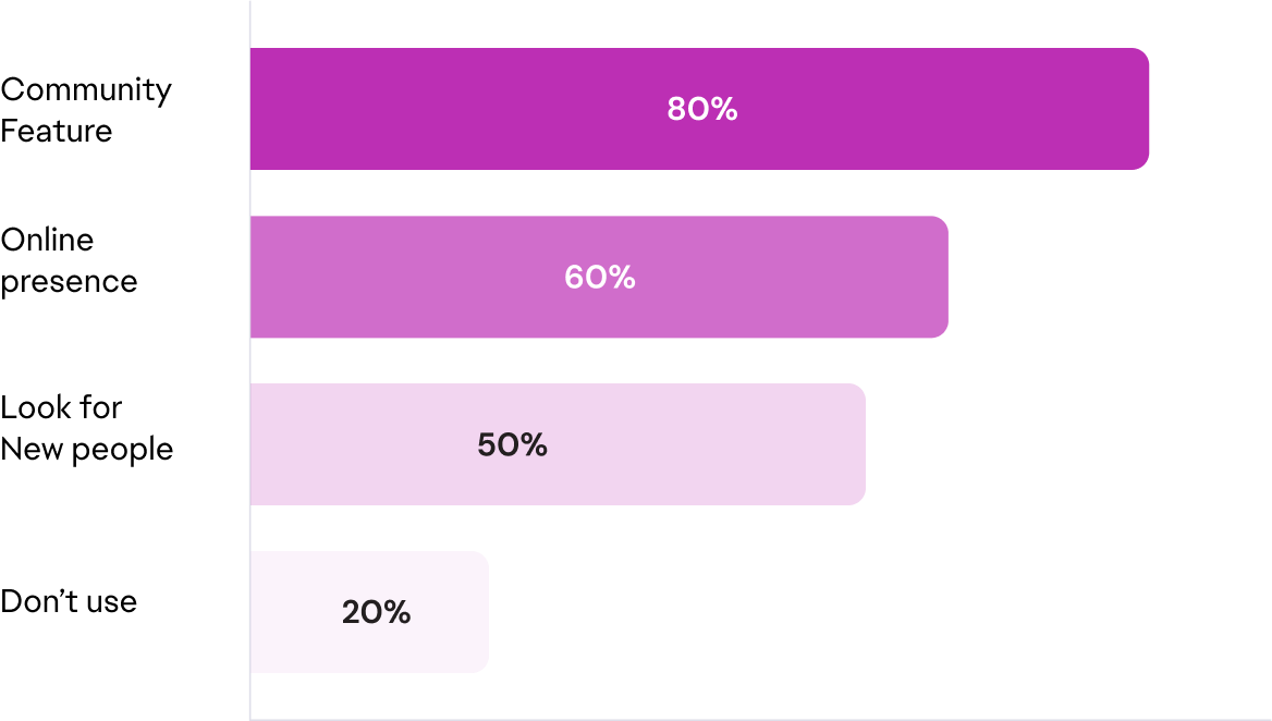
To understand more about the importance of online gaming communities, we created an online survey and were able to gather insights from 10 respondents who met our demographic criteria.
- 80% of respondents stated they’re more likely to play a game on a platform that offers a community feature.
- 60% said they prefer communities with good moderators, funny posts, and online presence from gaming companies.
- 50% said they’d be more likely to engage in a community where others were looking for new people to play with.
- 20% don’t use the community function regularly.
Define
Persona & Experience Map
The Moment of Opportunity
Based on our primary and seconary research findings, we created a Proto-Persona. Having a clear understanding of our users helped our team to understand the challenges faced by our users.
Meet Candid Carson
He is a Millennial gamer who enjoys gaming after a long day at work. He also enjoys connecting with others in the gaming community online, but is frustrated that he can’t play the game and view community boards all within the same platform.
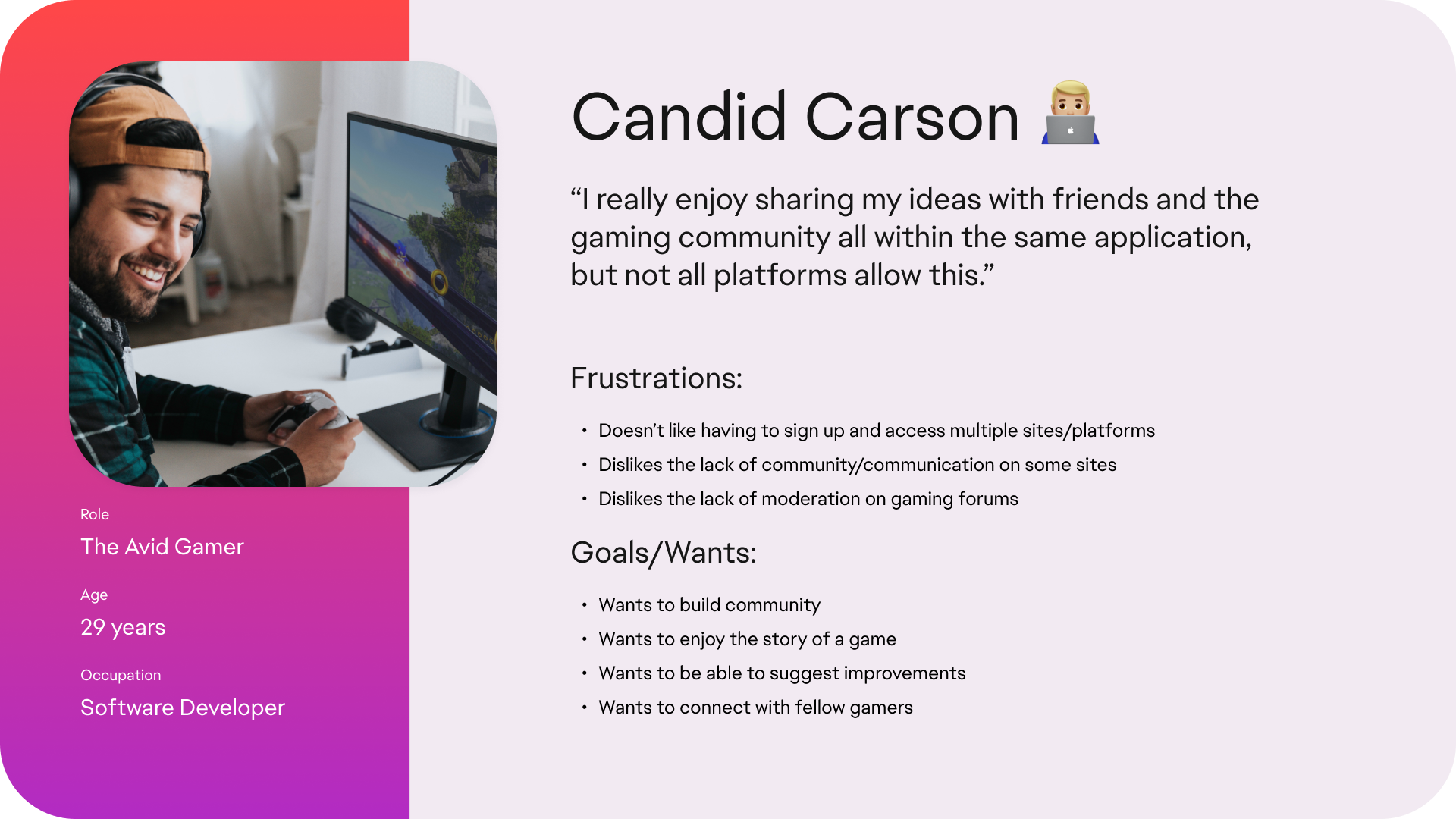
Proto Persona: Carson
Revised HMW Statement

Ideate
User Stories & Task Flows
Design and User Behaviour

Carson's current user flow
Caron’s current user flow is that he’s done work, wants to check out the latest posts, so he logs onto the EA Forum, and realizes he has to click on a specific game and then can only see posts about that game. Instead, he clicks away and goes to Steam, where he can see the most popular, latest, and trending posts across all the games he plays.

User Stories
After establishing user stories, our team created a task flow diagram which aligns with Carson's goals and motives. We focused on building a single task flow due to time contraints.
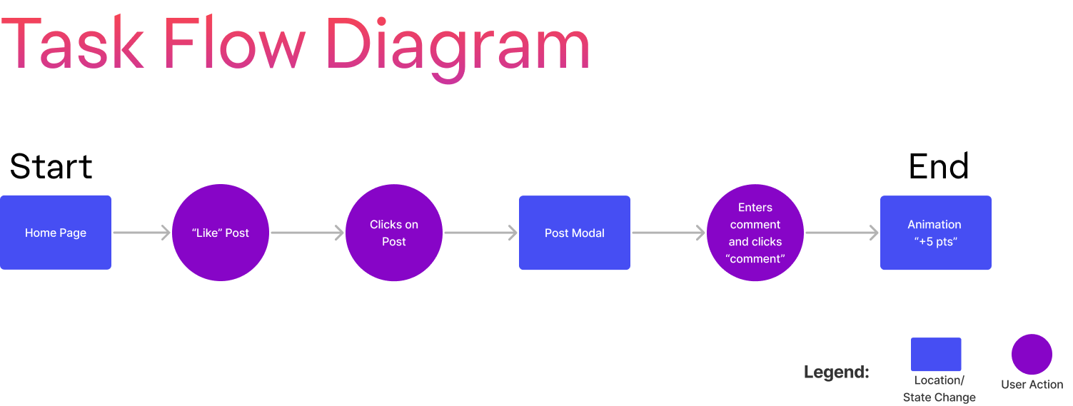
Task Flow Diagram
Prototype
Exploring Solutions
Sketching Concepts & Wireframes
After completing the task flow and understanding the users' needs, I began to sketching out our team's different ideas.
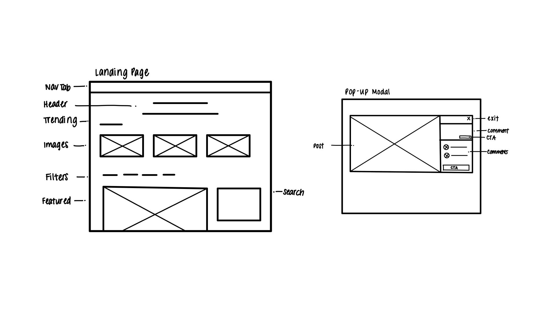
Concept Sketches
Upon checking in with the team, I began to a develop mid-fidelity gray scale prototype. This will help the web development team to begin coding the website.
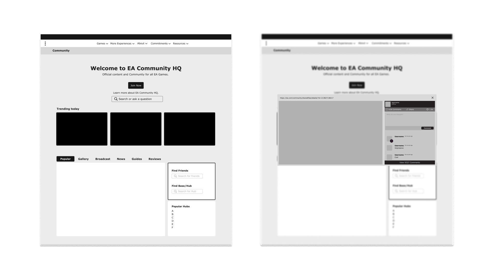
Grayscale Mid-fi Prototype
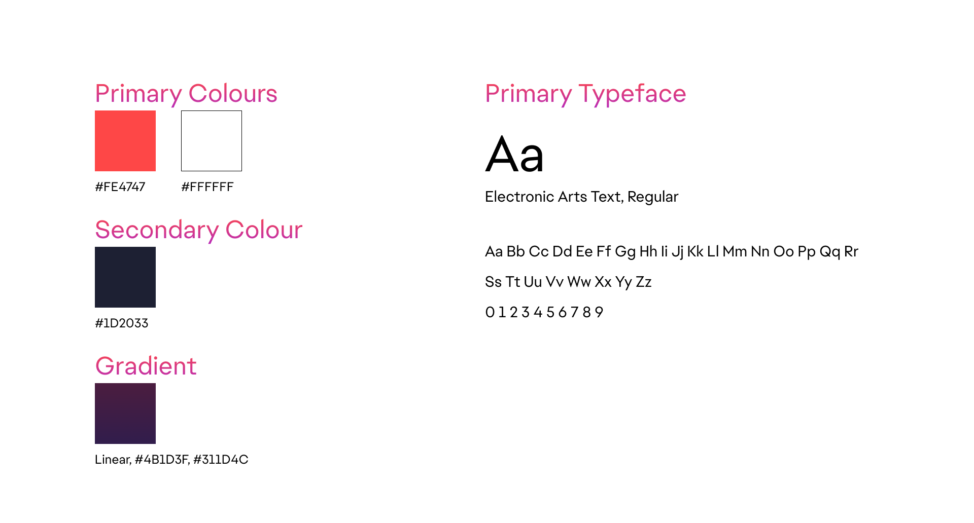
To align with EA's brand, we used referred to EA's. current website. We kept the same typeface, primary, secondary and gradient colours used by EA to represent the brand.
Reflection
My Takeaways
Key Learnings
- Communication is Key
- Divide and conquer
- Identify your strengths and concentrate on them
Next Steps
- Implement accessibility tools
- Increase interactions for comment section
- User testing
Next Project: Patients First >
